
In the world of data visualization and UI enhancement, one name stands out - Apex Charts. If you're using Ignition and haven't explored the wonders of Apex Charts yet, you're in for a game-changing experience. In this blog post, we'll delve into what Apex Charts is and why it is a must-have tool for your Ignition projects.
The Challenge of Ignition Charts
Ignition, a powerful industrial automation platform, is renowned for its versatility. However, when it comes to creating stunning and highly customizable user interfaces, Ignition charts have often fallen short. There are limitations in the variety of charts available, as well as the flexibility to customize them. This predicament has caused developers to spend extensive time and effort creating custom components from scratch for each project.
Enter Apex Charts
Apex Charts has emerged as the savior for Ignition users seeking to elevate their UI game. Apex Charts is a modern charting library that simplifies the visualization of data in web applications. It's an open-source HTML5 JavaScript library, hosted on GitHub and operates under the Apache license. This means it's freely available for anyone to use and modify according to their needs.
Apex Charts seamlessly integrates with various systems such as JavaScript, Angular, Vue, and React, making it highly versatile for various project needs. Here, we'll focus primarily on its application within JavaScript. However, it's worth noting that Apex Charts will work for projects involving other platforms, like React.
The best part about Apex Charts? There’s an Ignition module which effectively modularizes the entire GitHub repository from Apex Charts. You can easily download this module, import it into Ignition, and it will work just as smoothly as any other module.
Why Apex Charts?
Here's why Apex Charts should be on your radar:
Visually Pleasing UI: Apex Charts makes it remarkably easy to create visually pleasing and engaging user interfaces that enhance the overall presentation of your data.
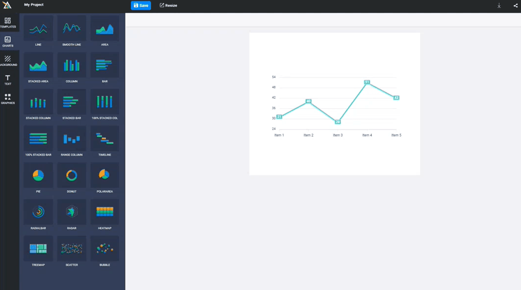
Enhanced Flexibility: Unlike the limitations of Ignition's built-in charts, Apex Charts offers an easy to use and flexible chart designer. Simply use Apex’s designer to develop your charts, then copy and paste them into Ignition.
Cost-Efficient: As an open-source tool, Apex Charts is cost-efficient, adding no extra financial burden to your projects or clients.
Time Savings: In a world where time is money, Apex Charts can drastically reduce your development time. Complex charts that used to take weeks can now be created in a matter of minutes.
Apex Charts brings to the table an unbeatable combination of aesthetic appeal, user-friendly design, cost-effectiveness, and time efficiency. It's a powerful tool that not only enhances the visual representation of your data but also simplifies the chart creation process, making it an ideal solution for seamless integration into Ignition. The benefits of using Apex Charts are clear, providing a significant upgrade over Ignition's built-in chart options.
Real-World Applications
To truly appreciate the capabilities of Apex Charts, let's look at a few real-world scenarios.
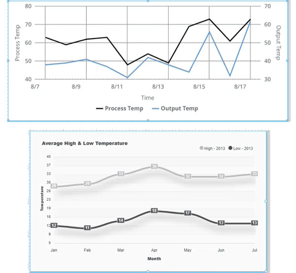
Customizing Axes
Ignition's built-in charts often struggle with customizing axes. Apex Charts, on the other hand, effortlessly allows you to set specific axis points and styles, saving you hours of workaround development.
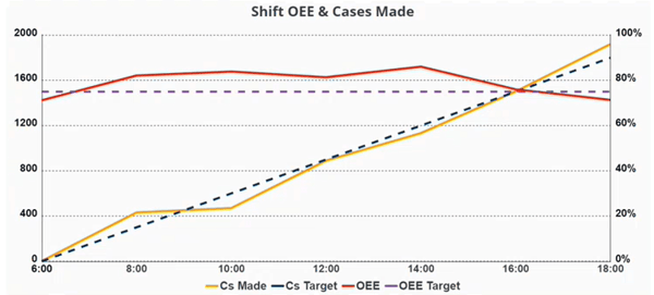
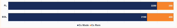
Progress Bars
Creating progress bar charts in Ignition can be a challenge. Apex Charts simplifies this process, reducing development time from days to mere minutes.
Dynamic Theming
Managing color themes in Ignition can be cumbersome. Apex Charts seamlessly integrates with stylesheet variables, allowing for dynamic theming without complex scripting.
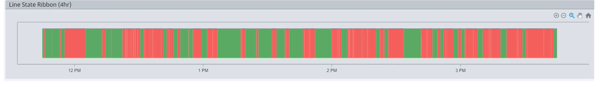
Custom Line State Charts
Ignition struggles to create certain charts like line state ribbons, whereas Apex Charts can handle these natively.
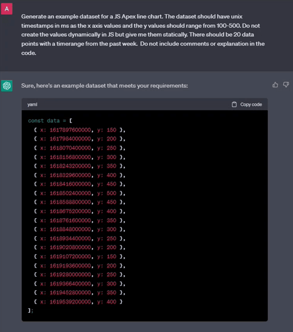
AI Generated Test Data
You can use ChatGPT to generate test data, making development much more efficient.
Exporting Data
Apex Charts provides a native option to export chart data to images or CSV files, eliminating the need for custom back-end scripting.
Getting Started with Apex Charts
Ready to embrace the power of Apex Charts in your Ignition projects? Here's how to get started.
Installation
Download the Apex Charts Ignition module from its GitHub repository and import it into Ignition as you would with any other module.
Integration
Add the Apex Charts component to your Ignition views and start designing your charts with ease.
Documentation
Explore the Apex Charts online Documentation. Then, check out the Options (Reference) dropdown for a description of every single property used within the charts.
Chart Editor
Use the online chart editor to create and customize charts effortlessly, then copy the generated JSON code for use in Ignition.
Advanced Customization
If you're proficient in JavaScript, you can embed custom JavaScript code into Apex Charts to achieve advanced functionality.
A New Era of UI
With Apex Charts, Ignition users now have a powerful tool at their disposal to create captivating, highly customizable, and performant user interfaces. Say goodbye to hours of tedious development and welcome a new era of efficient, visually stunning data visualizations. Whether you're a seasoned developer or just getting started, Apex Charts empowers you to create remarkable user interfaces that leave a lasting impression. It's time to elevate your Ignition projects with Apex Charts and redefine what's possible in UI design.


Comments