
If you work with industrial data, then you know that data visualizations are key to understanding what's going on inside your plant. In this post, we'll cover three particularly helpful ways to create these visualizations in Ignition Perspective.
First up is a classic: a stacked bar chart.
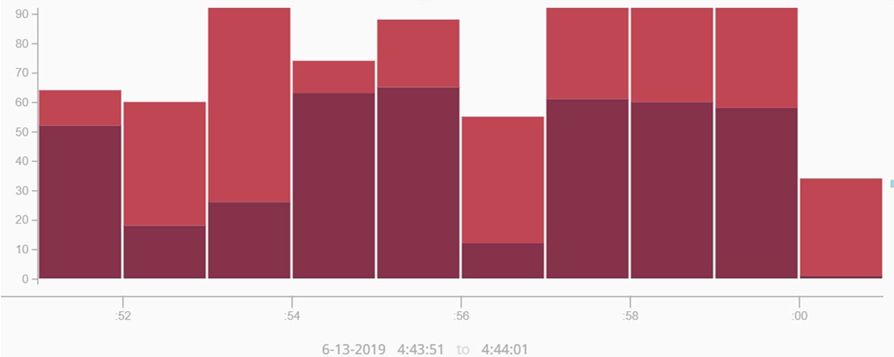
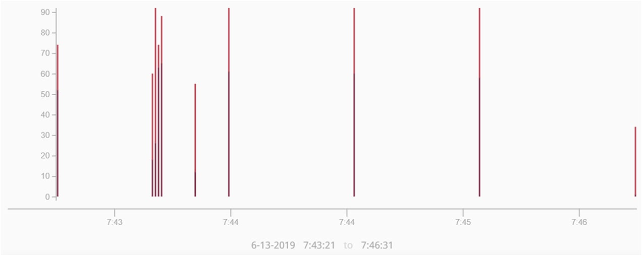
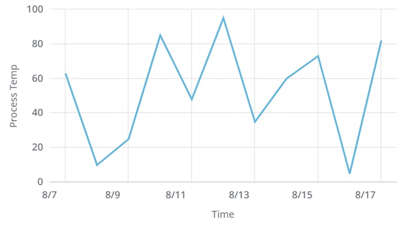
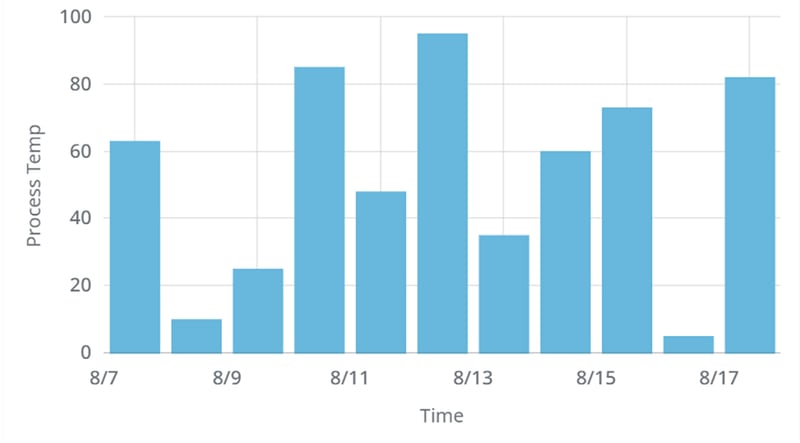
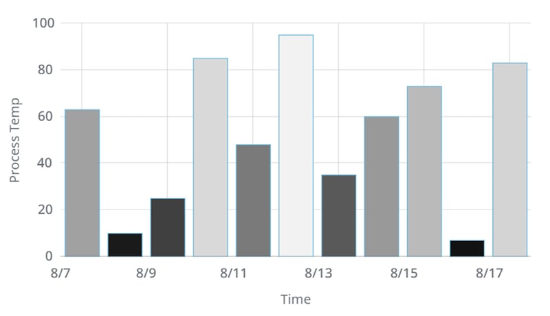
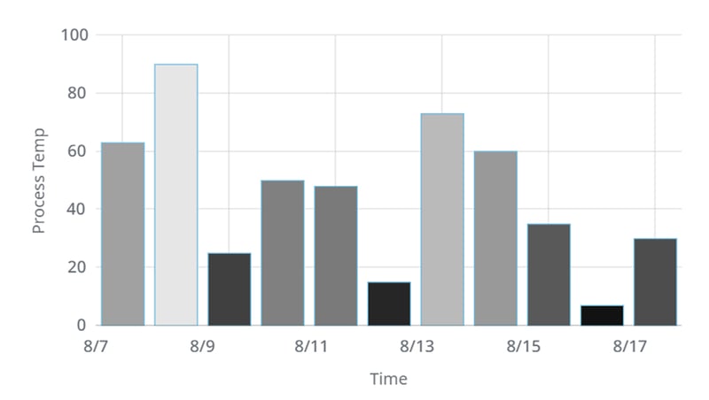
Although Ignition Perspective’s TimeSeries Chart can be configured to display a stacked bar chart, there's a problem: it turns out that the x-axis time range determines the width of the bar charts. This means that when you're working with data that has very small time intervals (seconds, or even smaller), the chart can result in tiny, almost imperceptible lines instead of a properly stacked bar graph.
This is an example of the same information presented over a short period vs a longer period. The first appears to be a stacked bar graph, whereas the second does not.
The good news is that there's a solution: by changing the configuration of the TimeSeries Chart, you can get the stacked bar chart you need.
How to Create a Stacked Bar Chart
Step 1:
Start with an XY chart. For simplicity, let’s work with the dataset that comes with the default XY Chart when you drag it in from the Perspective Components window. The default XY chart will look like this:
Step 2:
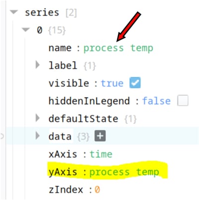
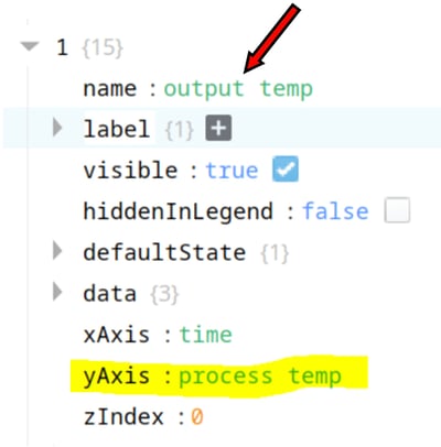
Click on the chart, go to the “Series 0” and “1” and configure them to be plotted on the same “yAxis” as shown below:
Step 3:
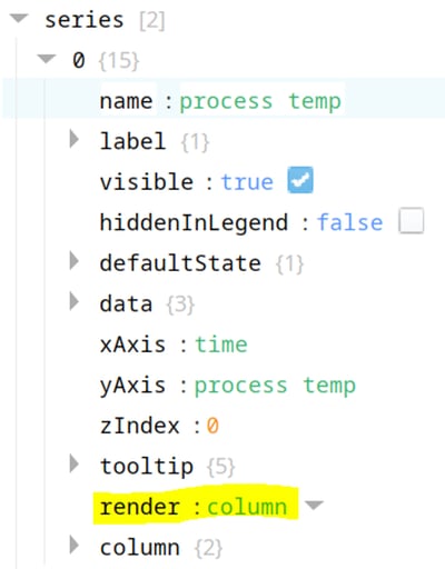
Change both “Series 0” and “1” property of “render” from “Line” to “Column”:
This alters the XY chart and now it should look like this: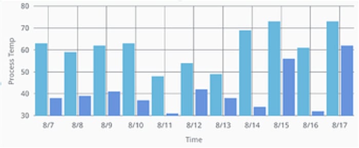
Step 4:
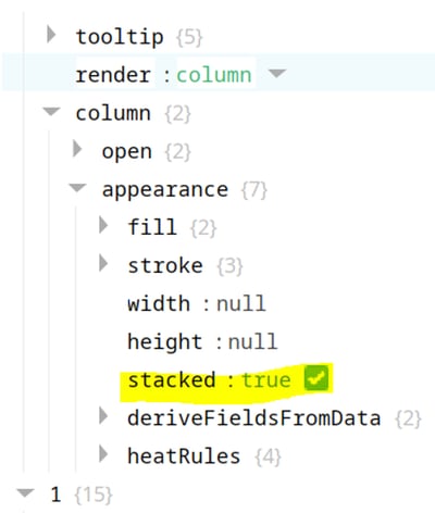
Since we selected “Column” in the previous step, we can now drill into the column property to get to “column/appearance/stacked” and check the box. Do this for both in the series.
This will produce the Stacked Bar Chart as shown below:
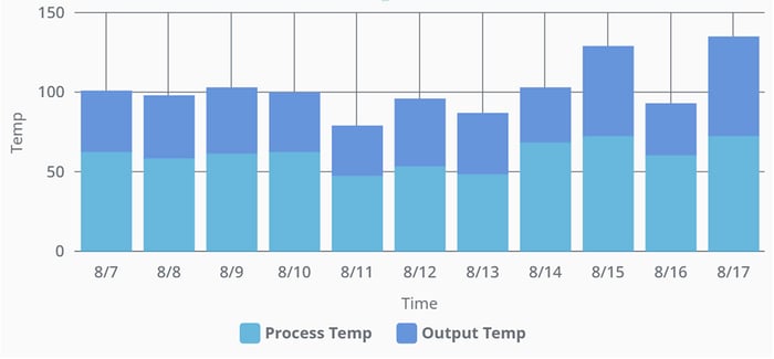
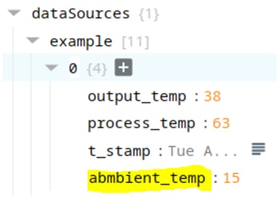
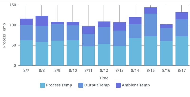
If you need 3 or more data that need to be stacked, then simply add more columns or keys to your “dataSources” & “series” and follow the steps below:
Data Dependent Colors in a Chart
In most applications, the chart color should remain the same to maintain a consistent color theme and to be easy on the eye. However, if you want to emphasize a data point that is in alarm or outside the acceptable range, you'll need a way to change the color of a bar or bullet based on its value. You may also want to display data dispersion across a gradient or a monochromatic color scheme.
In this section, we will show you how to achieve such effects using the “deriveFieldsFromData” property.
Step 1:
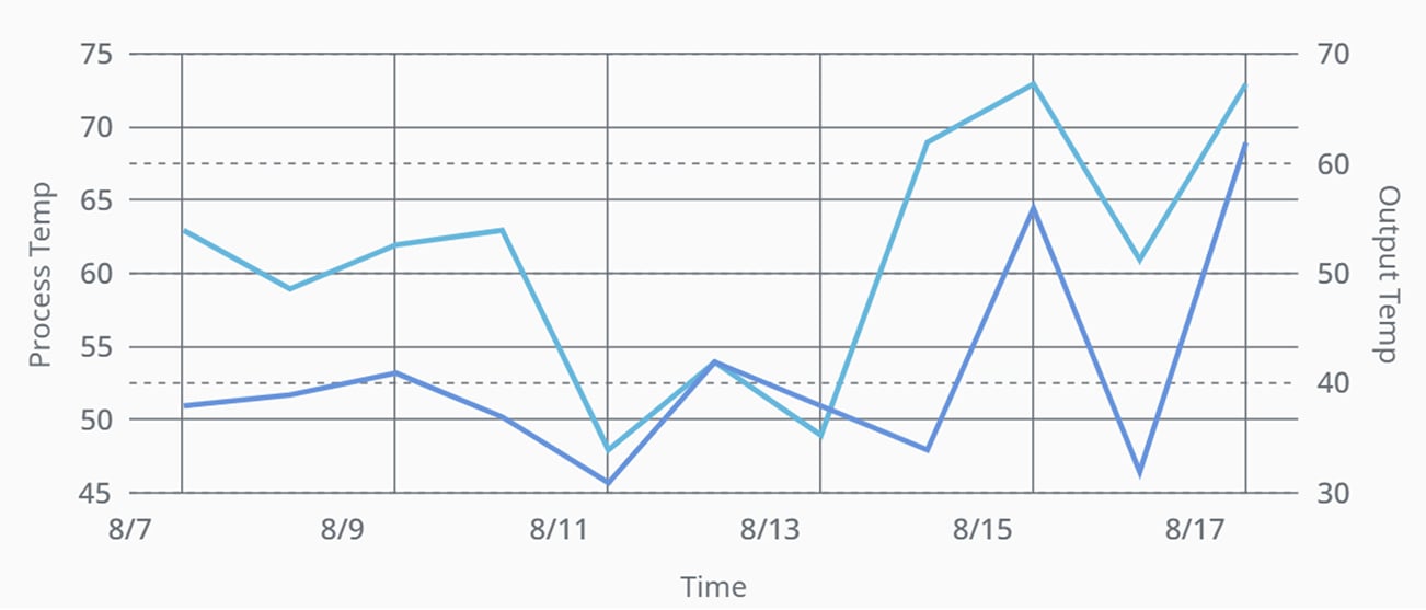
Let’s start with our familiar XY chart and its example dataset. To keep things simple, we will only chart a single parameter, the “process_temp” as shown below:
Step 2:
The above Line chart shows how the data changes over time but in your case, it might make sense to show this as a Bar chart, a few clicks (“series/0/render/column”) later you will be viewing a single-colored Bar chart:
 Step 3:
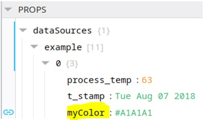
We will have to calculate the required color before we can introduce data value-dependent gradient or color. We could either calculate these as we bring in the data into the “dataSources” property or for demonstration purposes use Expression binding to calculate proportional colors for each data point. The modified “dataSources” property will look like this (the name “myColor” is arbitrary):
Step 4:
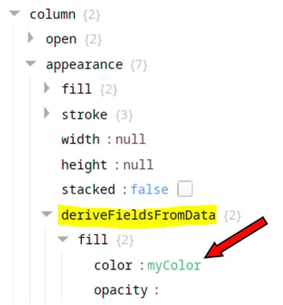
At this point, all we need to do is point the color property to this new calculated. Drill down to “series/0/column/appearance/deriveFieldsFromData/fill/color” and give it the calculated property name:
After this, the color of the Bars will change based on the value they represent.
What about Bubble Charts?
Bubble charts are a type of scatter plot that allows you to compare different values side-by-side. With this data visualization, the user does not need to read and compare numbers; instead, they can quickly gain an understanding of the values by taking a glance at the size distribution of the bubbles. This makes bubble charts a highly efficient method of visualizing data.
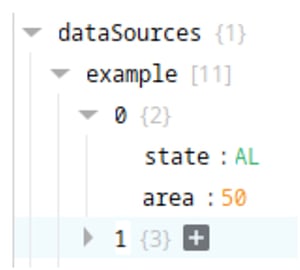
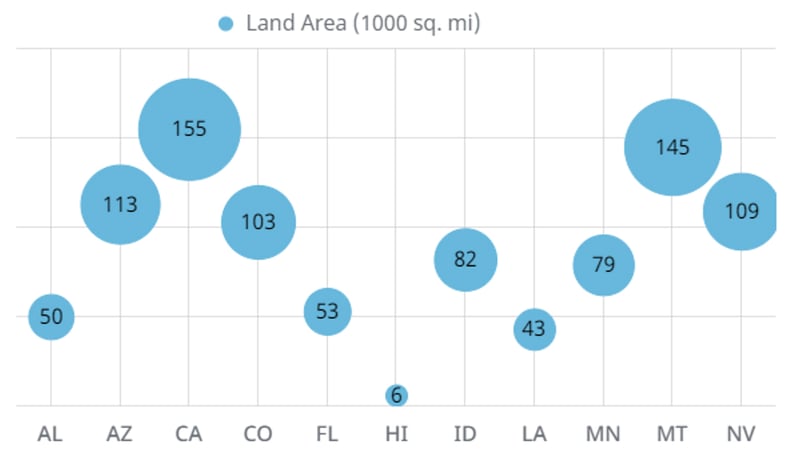
In this example, we will plot the land area of a few states in the USA. The states will be represented by bubbles, with the size of the bubble corresponding to the land area of the state.
Step 1:
We will start with the XY chart once again but this time we will use category for the x-axis instead of time and get the y-axis data (land area in 1000 sq. miles) from Wikipedia. Hence the dataSources will look like this:
Step 2:
Once a “render” property under “xAxes/0” is changed to “category” then it is straightforward to plot a simple Line Chart by selecting “line” for the “series/0/render”.
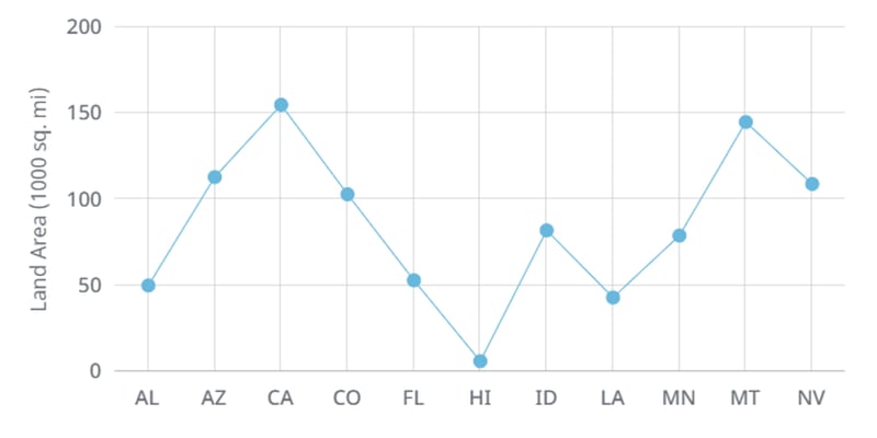
This does show the area for each state but the line connecting the data and the order of the states do not make any practical sense. This is where a Bubble Chart will come in handy as demonstrated in the following steps.
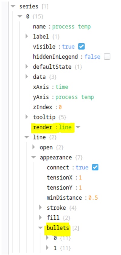
Step 3:
Perspective’s XYChart provides a convenient option to have multiple types of bullets for the scatter plot. Drilling into the “series/0/line/appearance/bullets” allows a couple of types of bullets. For this demonstration, we will use the “circle” and “label” as the two bullets.
Step 4:
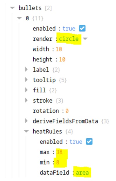
The circle “bullet” needs “heatRules” defined which allows us to determine the radius of the circle based on the data field of ‘area’ (in our example). The “min” and “max” values can be altered to change the circle size as needed.
Step 5:
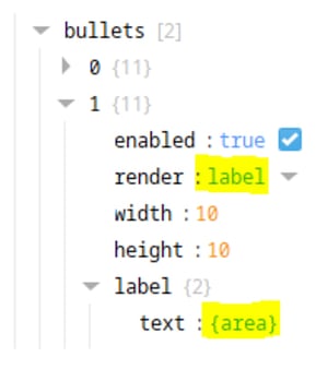
The second bullet would be a “label” pointing to the data property which is ‘area’ in this case. Note: enclose the data property in {} to ensure the values come through.
This will result in this Bubble Chart which is easy to read and aesthetically pleasing:
CONCLUSION
Creating interesting data visualizations in Ignition Perspective is relatively simple and only requires a few quick steps. With these visualizations, you can easily compare different data sets and get a clear picture of your industrial information. If you have any questions about charting in Ignition Perspective, don't hesitate to reach out to us. We're always happy to help.
For more Vertech tips and news, click here.


Comments